Last year, I collaborated on a project that ended up being published in Je decor magazine.
Originally I was hired to help make Louis & Lauralee’s kitchen more functional. That kitchen was my most popular article on the blog, and on social media. You can see it here if you’ve missed it.
After the success with the kitchen, I was hired to do the rest of the two-bedroom apartment except the nursery, which they did themselves. The result is a simple, uncluttered living space that reflects the renters’ personalities.
Here are some pictures if you’d like to see:
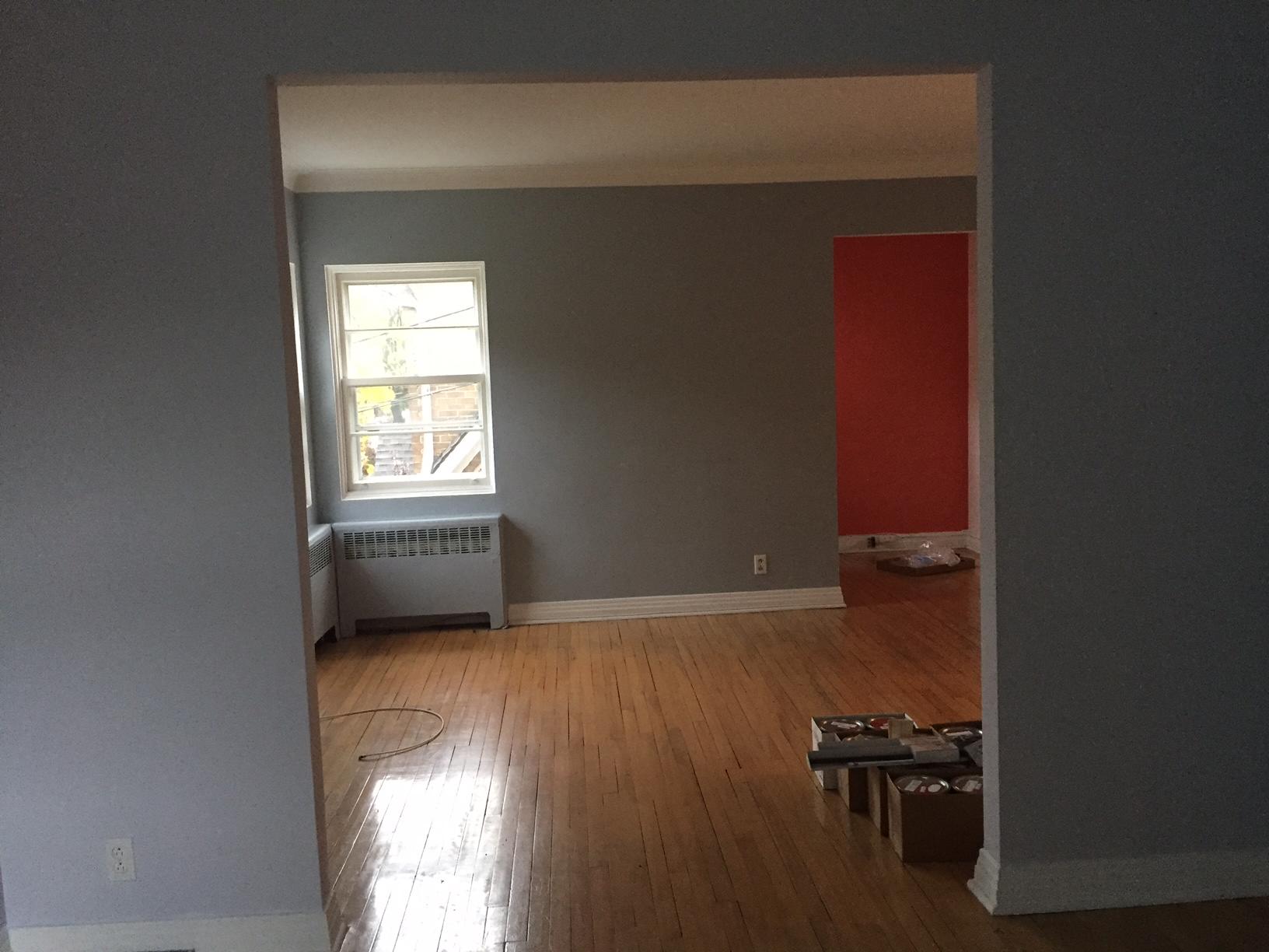
LIVING ROOM
BEFORE
The colours were kind of all over the place with grey, white, blue, and red! We came up with a colour concept that pleased my clients. For this space, they wanted something neutral, but that could go with the warmer colours they wanted in the adjacent dining room & kitchen (purple & red)…

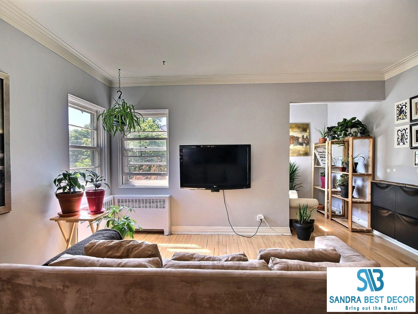
AFTER:
I chose cement grey, which has a purple undertone.
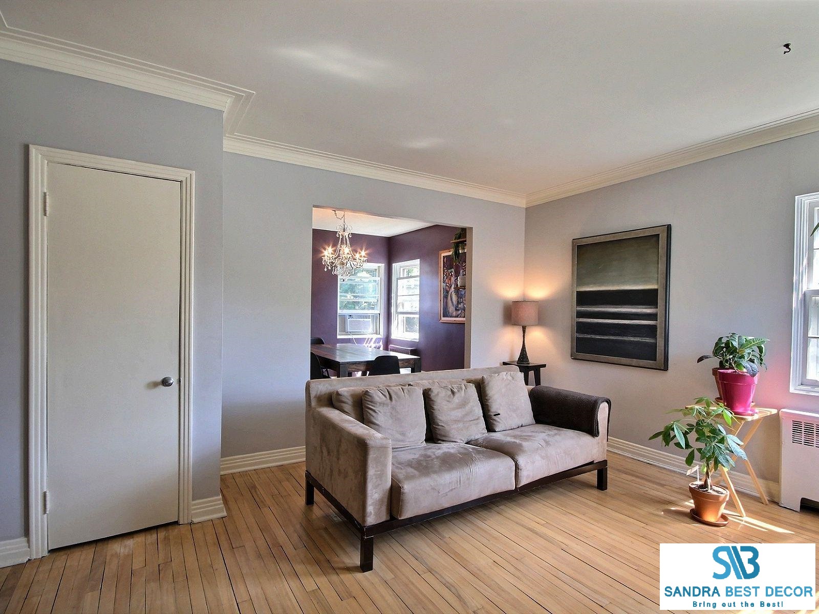

Sofa (Similar): Brault & Martineau
Shoe storage (black units): Ikea
DINING ROOM
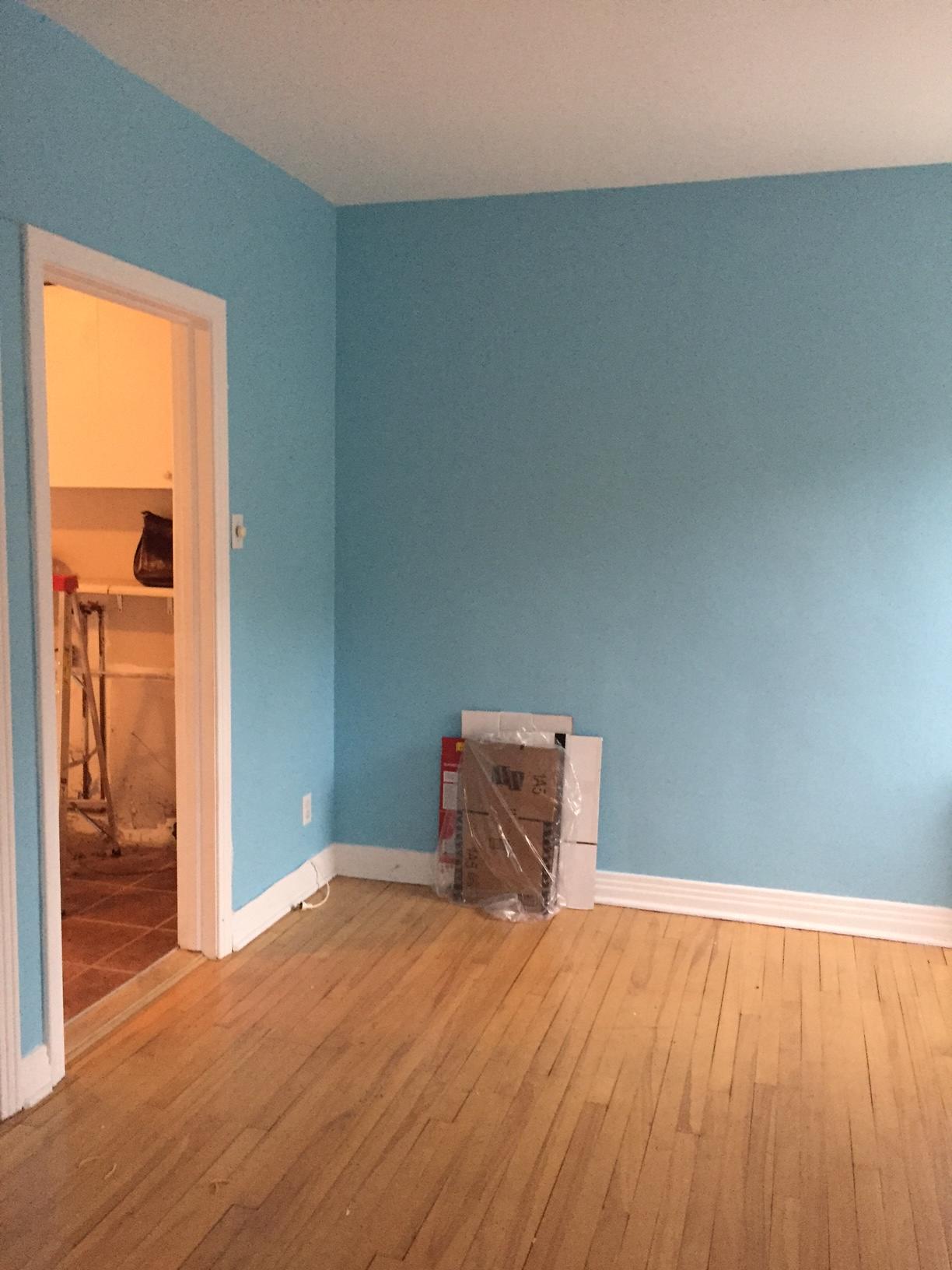
BEFORE:
The dining room felt like a baby’s room with that light blue on the wall!

AFTER:
My clients were very bold and obviously are not afraid to dare with colour. They fell in love with this purple!


Since they have a large family and love to entertain, we chose an oversized dining table flanked with a bench on one side and chairs on the other.
Chairs : Wazo
Table & Bench: Exotik Mobilier
Light Fixture: Multi Luminaire
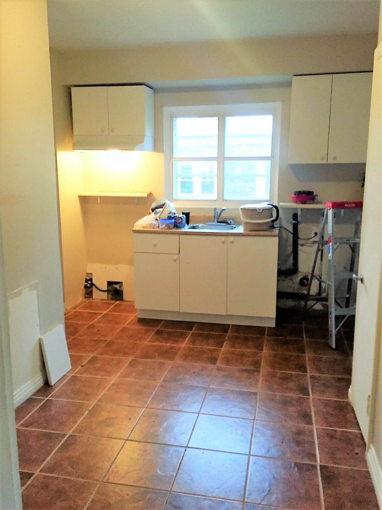
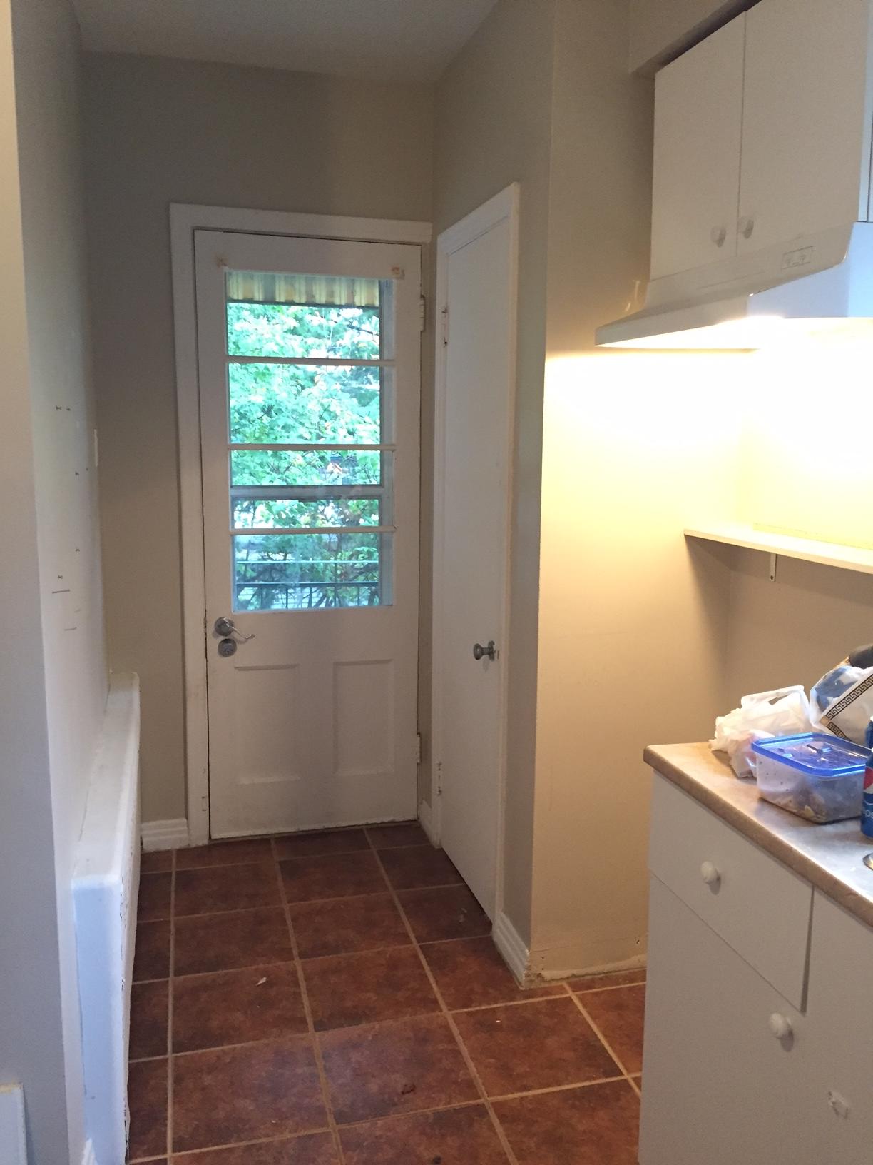
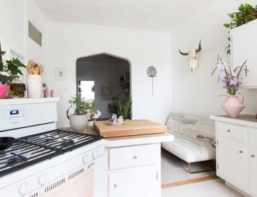
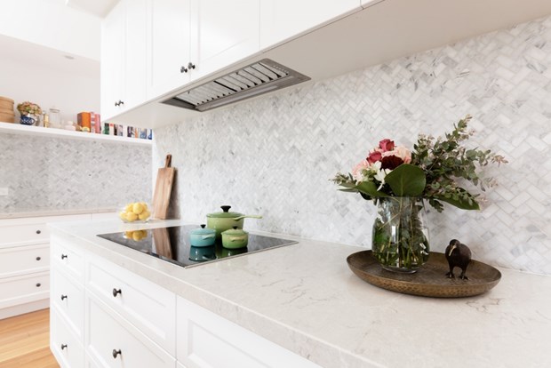
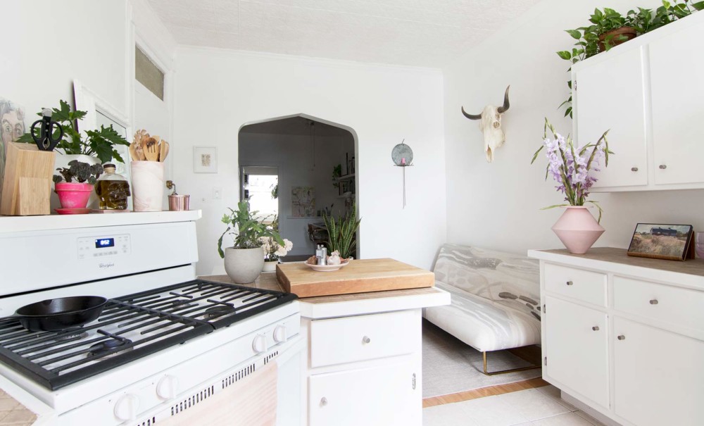
KITCHEN
BEFORE:
Gosh! The kitchen had no storage and no character. I suggested a rasberry pudding colour for the wall, and they jumped on it!!
AFTER :
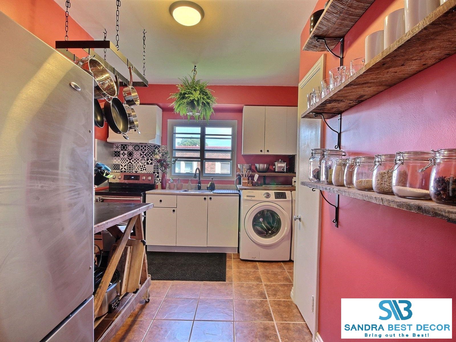
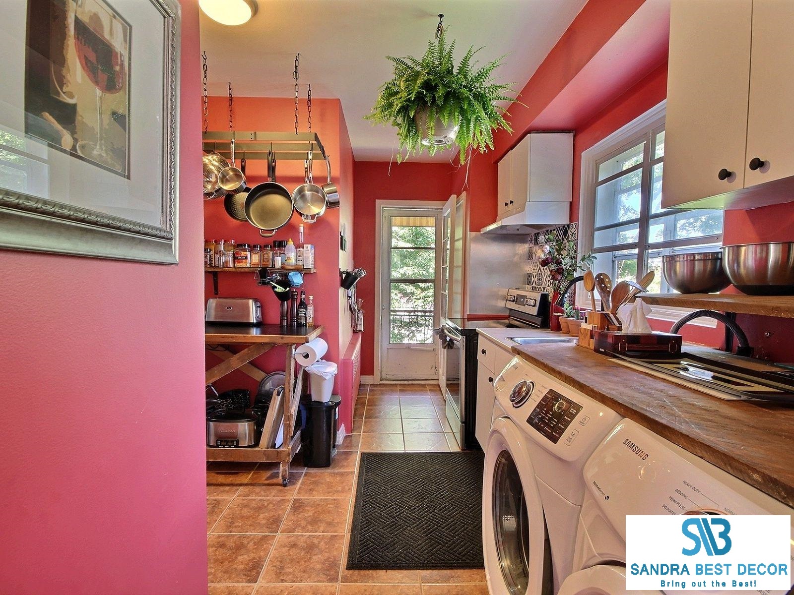
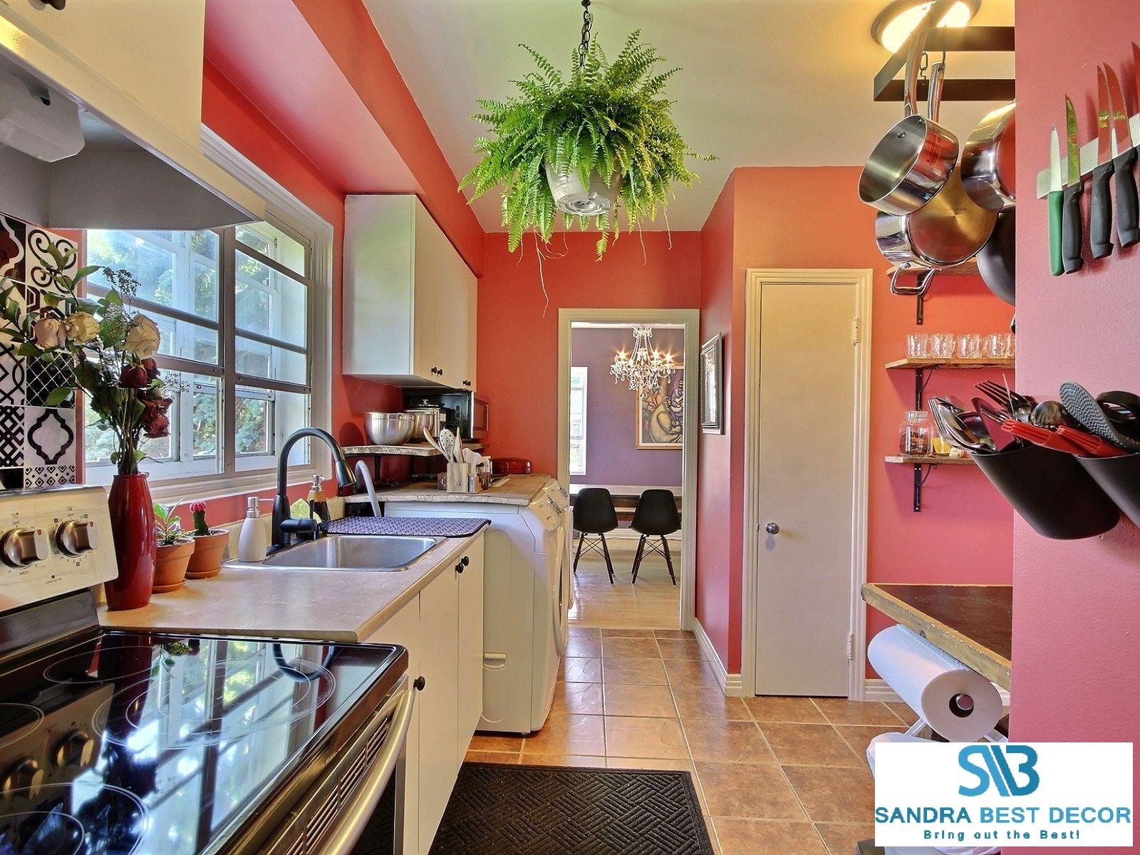
Faucet : Home Dépôt
Pot Holder: Wayfair
Wood shelves: Bois de grange
Brackets: Ikea EKBY HALL
Magnet for kitchen: Ikea GRUNDTAL
Rail: Ikea Fintorp
Hooks: Ikea Fintorp
Master bedroom
I don’t have before pictures! But again, my clients were bold in picking a dark blue note on the wall.

